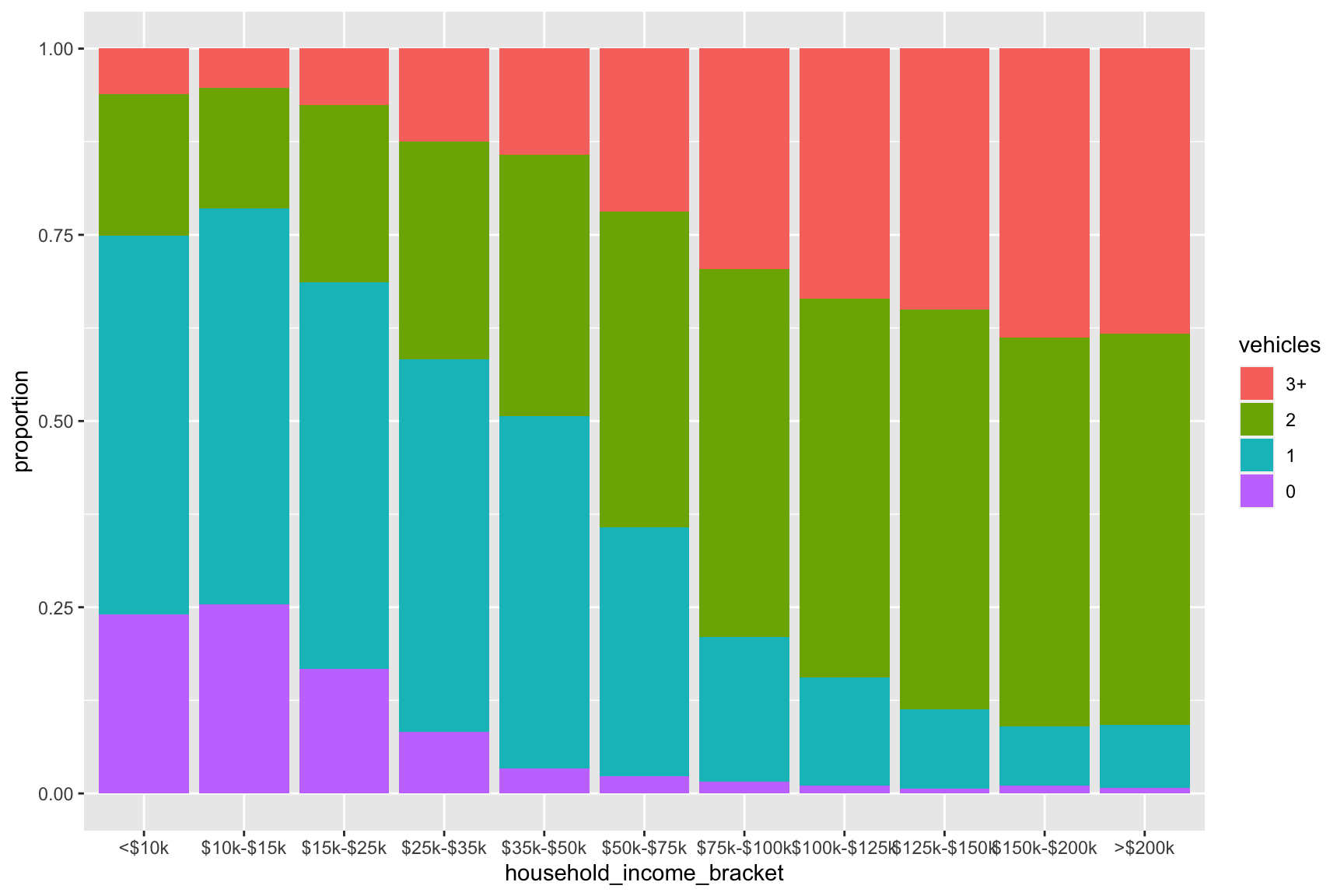
1 Introduction
Let’s find out what proportion of households in the Triangle within each of the U.S. Census ACS household income brackets own 0, 1, 2, and 3+ cars!
2 Get some data
Let’s pull in the census data necessary. Vehicles by Income is not tabulated in the ACS area releases so we’ll need to use the microdata (2019 this case). Thus, we’ll define the Triangle as all Census Public Use Microdata Areas that intersect the Raleigh-Durham-Cary Combined Statistical Area:
show the code
mapview(PUMAs, layer.name="PUMAs in analysis") + mapview(csa,color = "red", lwd=2,alpha.regions=0, col.region="red", layer.name="Raleigh-Durham-Cary CSA")3 Summarize data
Now we summarize the household level data by breaking the household income variable into 11 brackets, and the vehicles variable into categories of 0,1,2, and 3+ vehicles. We also plot the results
show the code
#write_csv(data,"data.csv")

data <- read_csv("data.csv")

data2 <- data %>% filter(SPORDER==1) %>%
  filter(PUMA %in% geoids$PUMACE10[which(geoids$perc_puma_area>50)]) %>%
  mutate(
    household_income_bracket = case_when(
      HINCP < 10000 ~ "<$10k",
      HINCP >= 10000 & HINCP < 15000 ~ "$10k-$15k",
      HINCP >= 15000 & HINCP < 20000 ~ "$15k-$25k",
      HINCP >= 25000 & HINCP < 35000 ~ "$25k-$35k",
      HINCP >= 35000 & HINCP < 50000 ~ "$35k-$50k",
      HINCP >= 50000 & HINCP < 75000 ~ "$50k-$75k",
      HINCP >= 75000 & HINCP < 100000 ~ "$75k-$100k",
      HINCP >= 100000 & HINCP < 125000 ~ "$100k-$125k",
      HINCP >= 125000 & HINCP < 150000 ~ "$125k-$150k",
      HINCP >= 150000 & HINCP < 200000 ~ "$150k-$200k",
      HINCP >= 200000 ~ ">$200k"),
    vehicles = case_when(
      VEH == 0 ~ "0",
      VEH == 1 ~ "1",
      VEH == 2 ~ "2",
      VEH > 2 ~ "3+",
    )
  )

plot_data <- data2 %>%
  group_by(household_income_bracket,vehicles)  %>%
  summarize(proportion = sum(WGTP)) %>%
  group_by(household_income_bracket) %>%
  mutate(vehicle_percentage = 100*proportion/sum(proportion)) %>%
  ungroup() %>%
  filter(!is.na(household_income_bracket))


plot_data$vehicles<- factor(plot_data$vehicles, levels = c("3+", "2","1","0"))

plot_data$household_income_bracket <- factor(plot_data$household_income_bracket, levels = c("<$10k","$10k-$15k","$15k-$25k","$25k-$35k","$35k-$50k","$50k-$75k","$75k-$100k","$100k-$125k","$125k-$150k","$150k-$200k",">$200k"))

# Stacked + percent
ggplot(plot_data, aes(fill=vehicles, y=proportion, x=household_income_bracket)) +
    geom_bar(position="fill", stat="identity")